| |
 |
| <
Return to story |
| |
 |
|
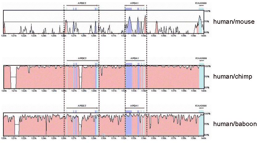
| In these comparative genomic
charts, it is easy to see why meaningful comparisons between humans
and other primates have been difficult. The pink areas represent regions
of high conservation between the two species being compared, (meaning
the sequences are the same in both), the blue areas represent the
positions of protein-coding regions and the purple areas represent
the non-protein coding parts of a gene. |
|
|

